aCQUISITION
tRANSACTIONS
Engagement
b2b2c white labeled mobile trading platform
0-1 ux
Wave 2.0: Tackling the problem of declining user base for traditional brokers in the evolving market
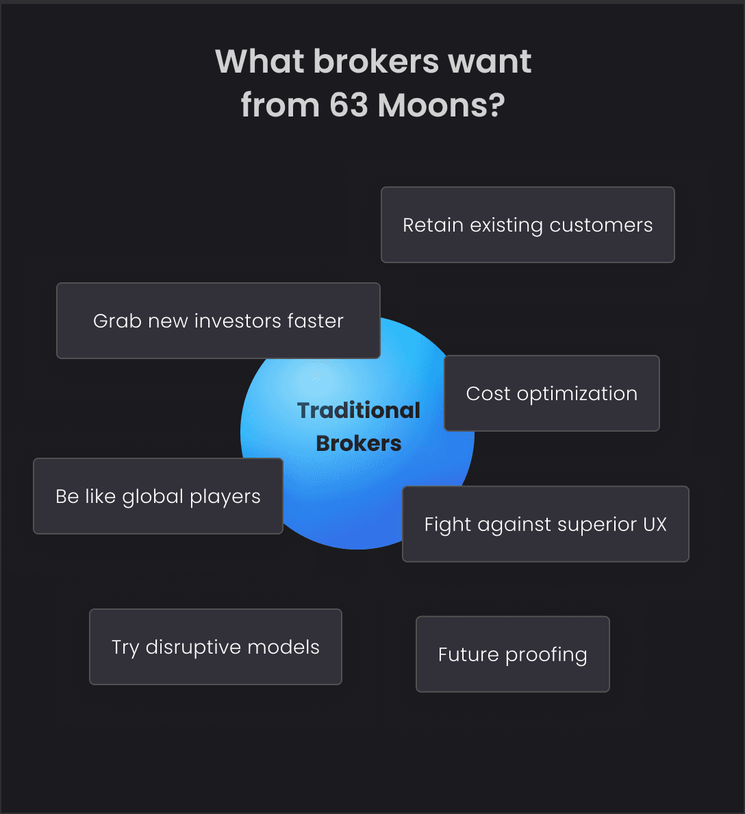
Historically, 63 Moons’s Wave has been a leading white-labeled app for traditional brokers, facilitating their broking services. With the rise of many digital-first brokerage firms and start ups, offering more user-friendly platforms, traditional brokers faced a huge decline. In response, they sought 63 Moons for a competitive application capable of both retaining and attracting customers in this evolving market.
63 Moons Wave 2.0 Promo video
Duration
1 year (Feb 2020 - Feb 2021)
Key Tasks
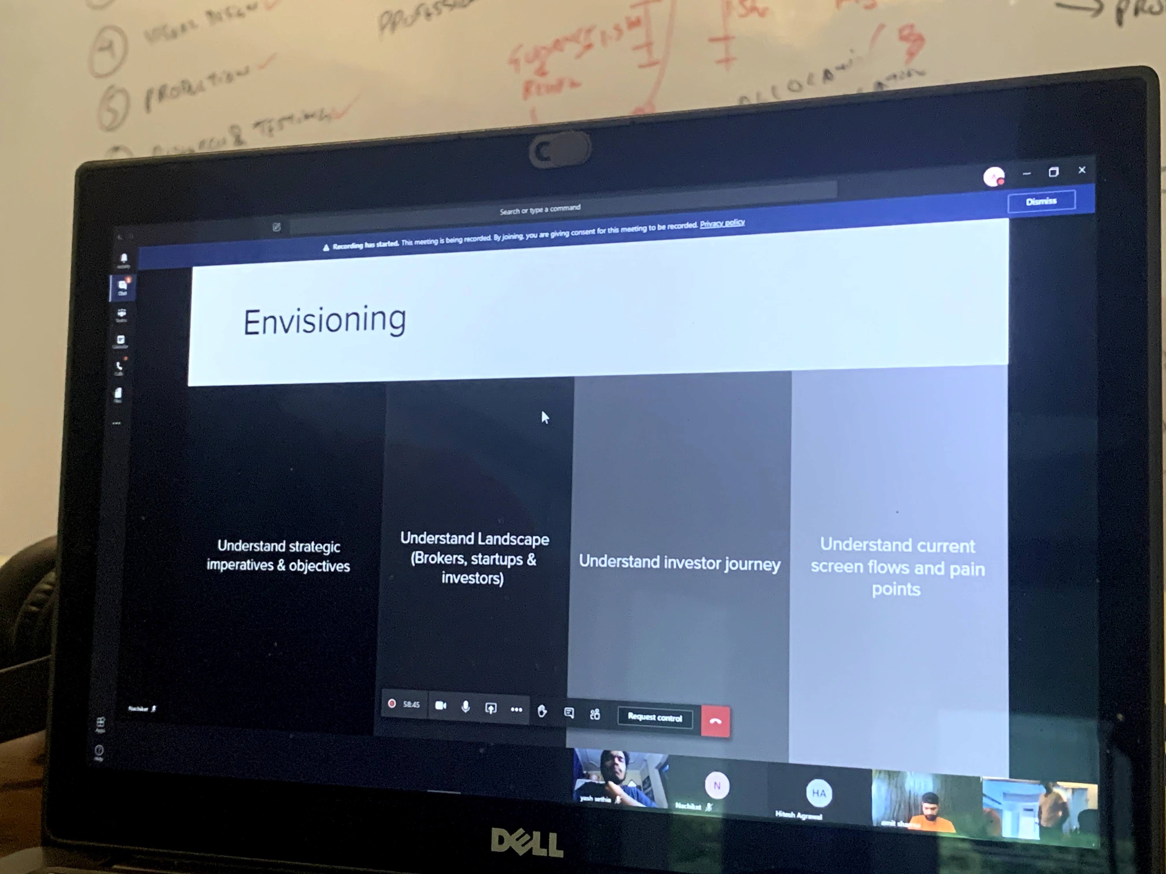
Product Envisioning
Product Strategy
UX Architecture
User Flows & Journey
Sprint Planning
Process & Scope Management
UI Design
Design System
Micro Interactions & Motion Design
Development coordination & Support
Tools used
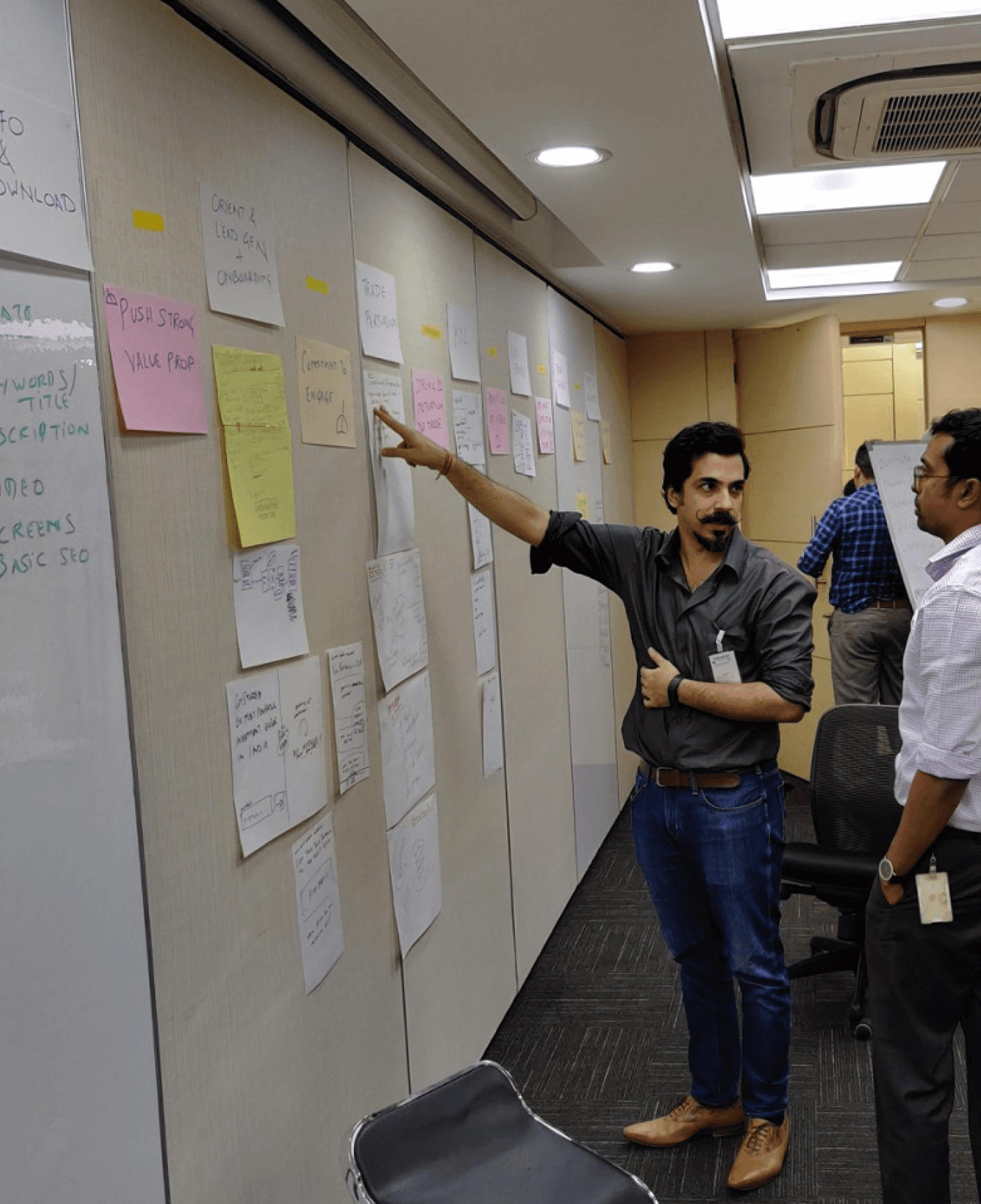
Pencil, paper, sticky notes, sharpie, markers & whiteboard. How can a designer even live without that?! 🤷🏻♂️ But also...

Adobe XD

Zeplin

Zoom

Teams

Power Point

Excel

Zoho

My Role
As the lead product designer for THEM Consulting, I managed the project and designed the end to end experience for Wave 2.0, a flagship product of 63 Moons (a client of THEM Consulting).
Shaping the end to end experience of the product.
Determined design priority and scope of projects with senior stakeholders & managed deliverables.
Spanned the entire design process, from initial product envisioning sessions with senior stakeholders through to final production.
Instrumental in establishing a comprehensive design system to facilitate development and maintain modularity.
Worked closely with engineering team to provide support development challenges, smooth animations and high production quality.

The Team


Akhilesh (Me)
Product Design Lead,
THEM Consulting

Nachiket
Design Director,
THEM Consulting

Pallav
Product Designer,
THEM Consulting

Mithun
Product Manager,
63 Moons

Ronojoy
Head Product Strategy,
63 Moons

Aditya Male
Software Developer,
63 Moons
*The rise in numbers are an approximation based on the data from the period of 2021 - 2022.
Performance Overview
The numbers are buzzinggg!!
The outcomes of this innovation have surpassed expectations, showcasing remarkable results that highlight the success of this product.
Apps created
Trades per day
Trades per year
Avg. peak user session

The Process
From Zero to Hero. Of course its not a linear process. 🚀
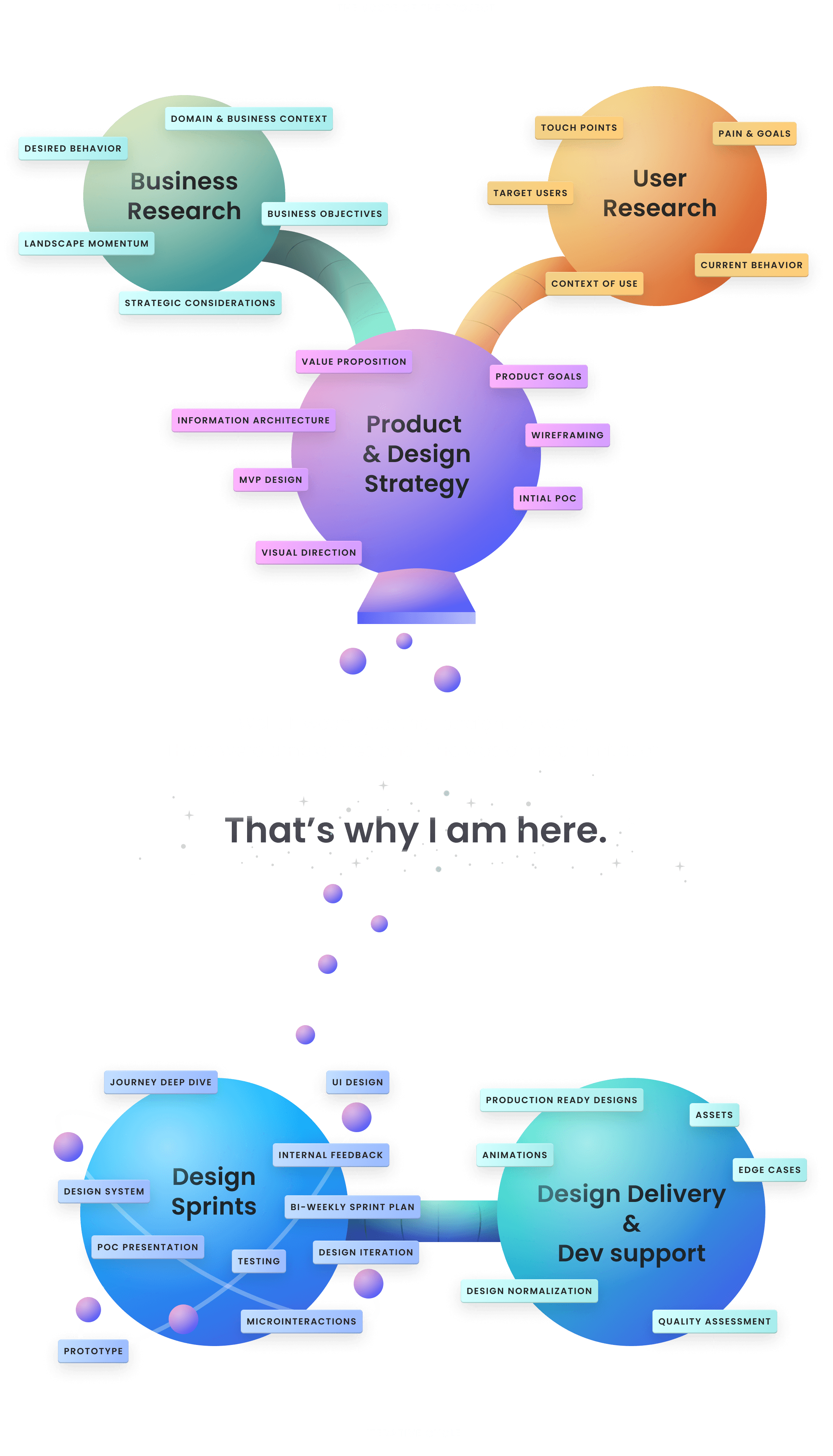
User Research & Business Context
Here is a quick and detailed glimpse of the context 🔭.
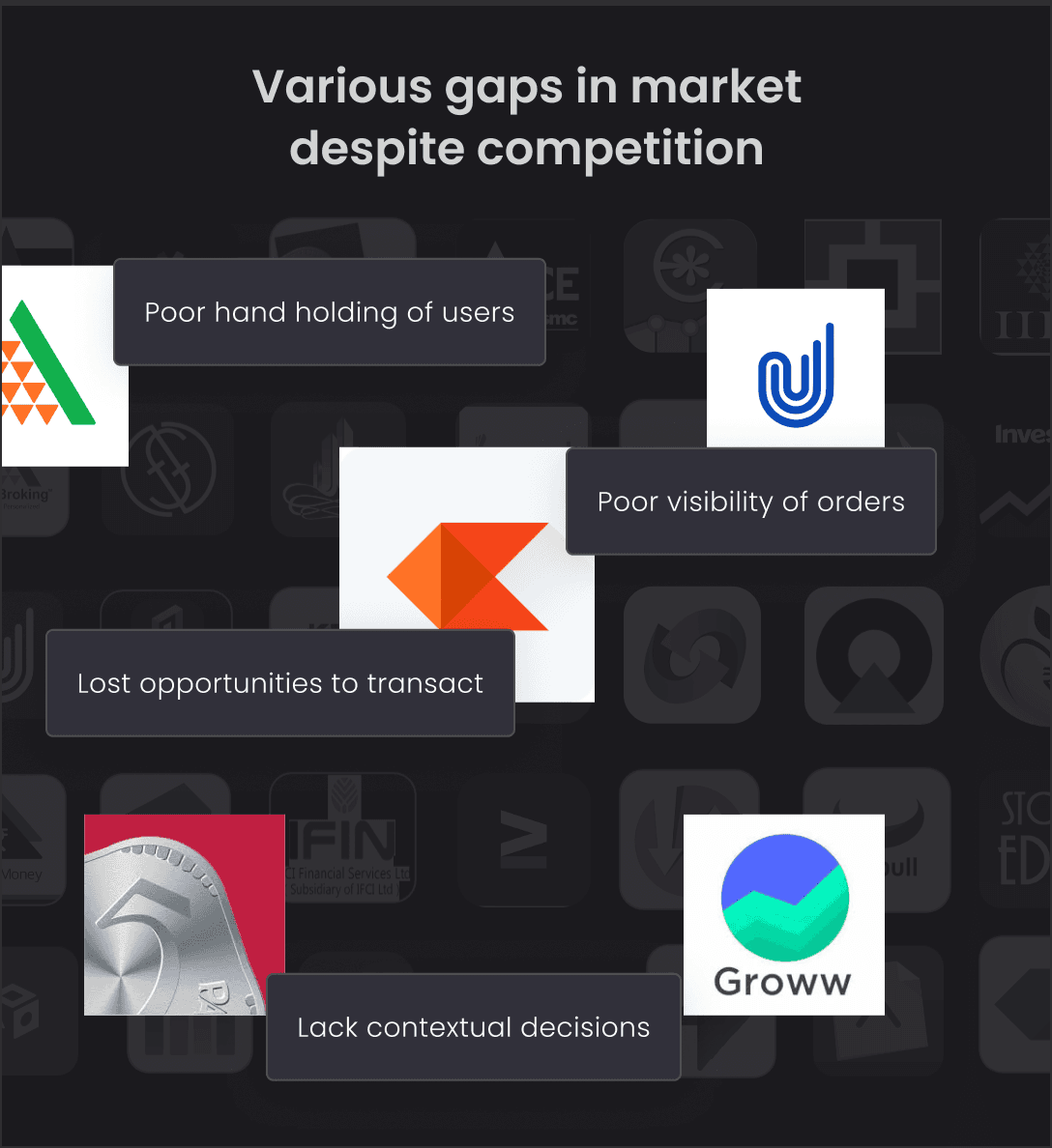
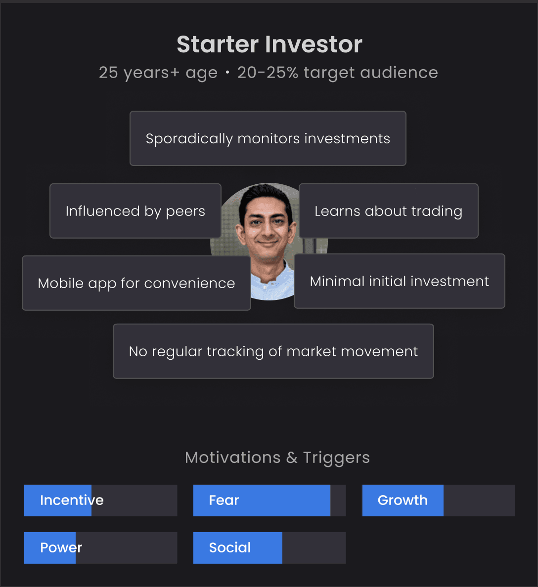
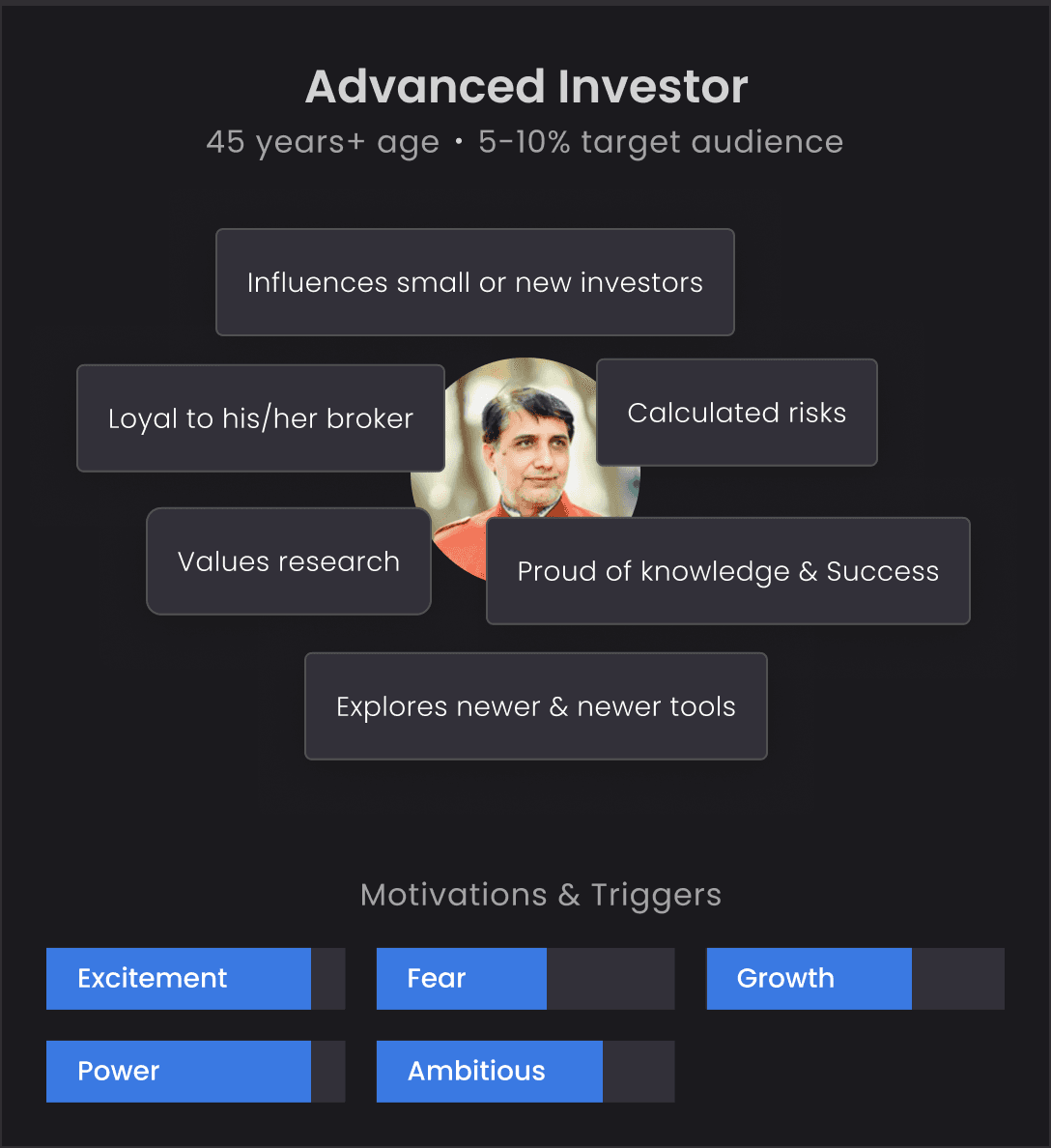
The design strategy team embarked on a complex mission to decode the broking market's dynamics by engaging with brokers, traders, investors, and the 63 Moons sales team. Insights gathered highlighted the urgent need for traditional brokers to upgrade to digital platforms. In crafting a B2B2C product, identifying the elements of 'Superior UX' became vital, aiming to boost transactions, engagement, and loyalty.
DEFINING THE Product Goals
What did we aim to achieve?
Drive engagement & transactions
Acquire & retain more
Easy customization & modularity
Build trust through contextual guidance
New Paradigm for future & options
Improved discoverability & navigation

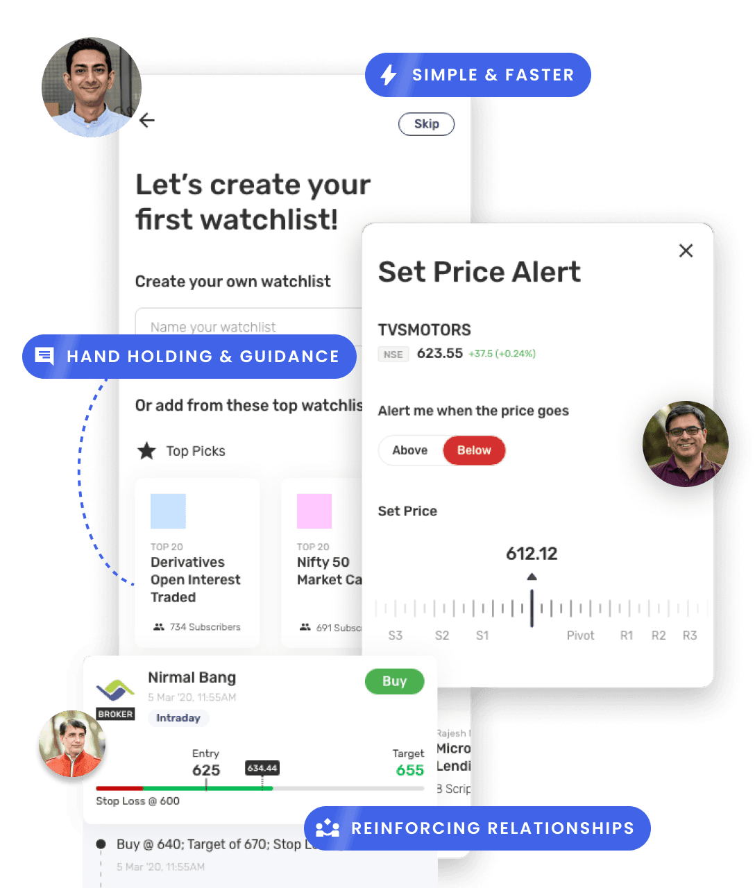


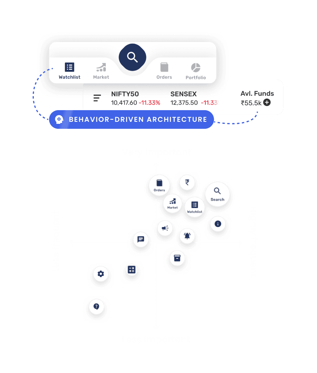
The final design
Presenting to you, Wave 2.0 ✨
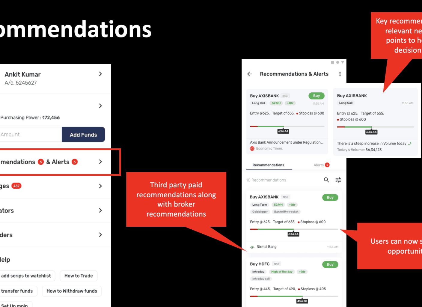
Following an in-depth product envisioning and journey-mapping process, we identified several critical paths essential for the product's success. While my involvement spanned the initial concept to launch, here I will focus on the key journeys that significantly boosted conversions.
The Watchlist
Search
Option Chain
Buy & Sell
Scrip Details
Portfolio Analysis
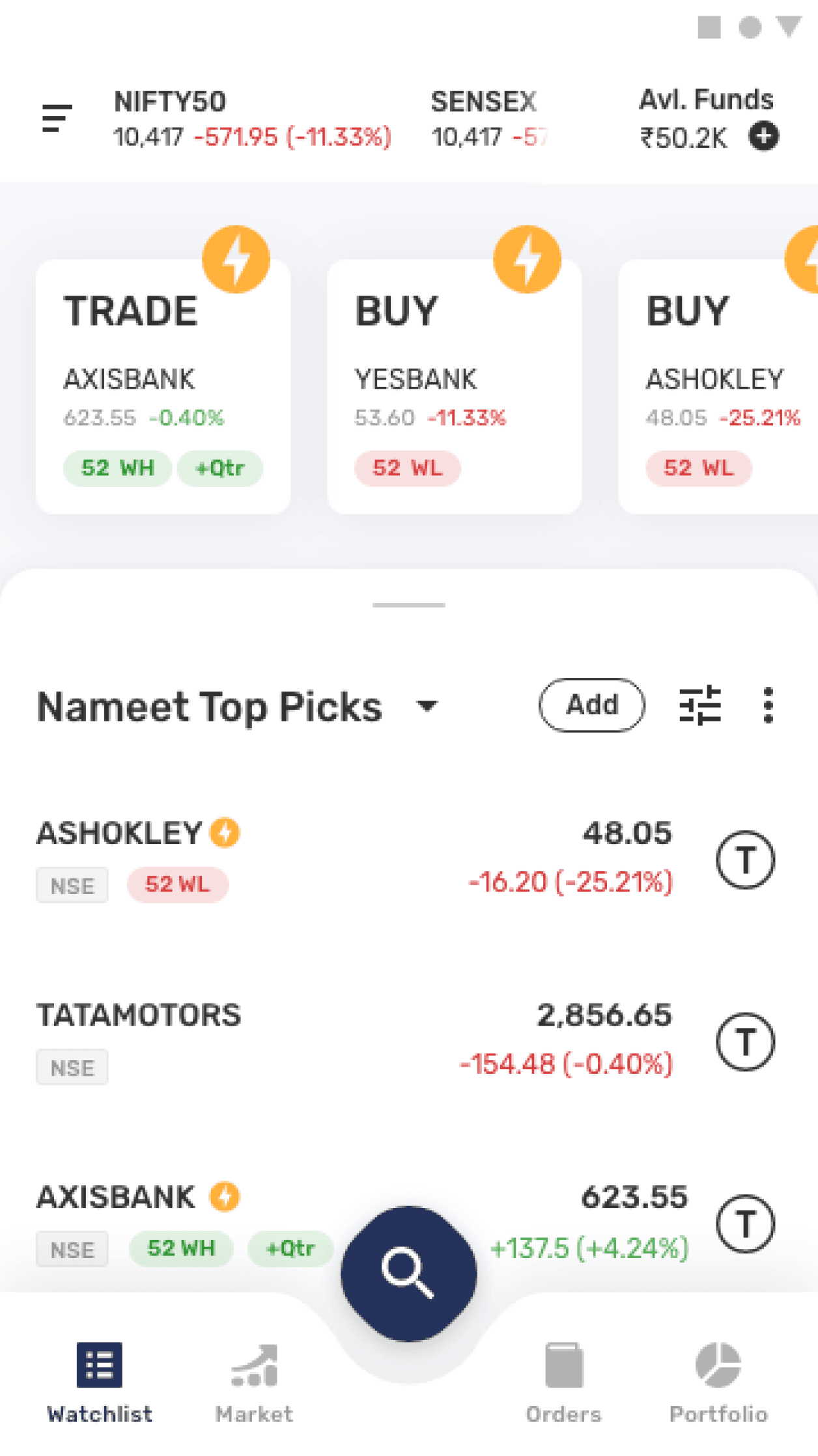
What is the watchlist?
Watchlist in a nutshell
Allows to monitor preferred stocks in one accessible location.
Provides live updates of prices & changes.
Avoids the constant need to search for stocks.
Allows to perform several actions such as setting alerts, viewing details, etc.
Its a customizable list. There could be several watchlists created by an investor.
The problem with existing watchlists




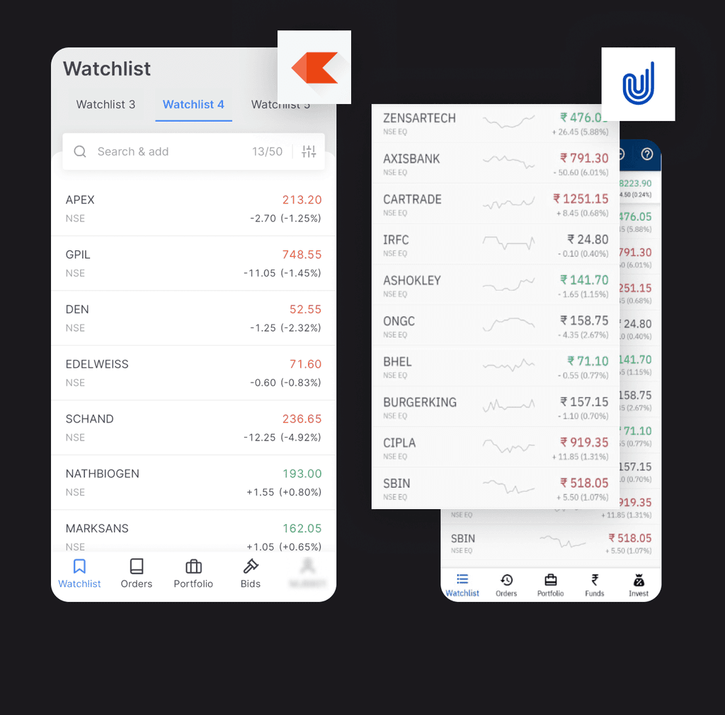

Demands attention & vigilance
Current watchlist designs across several competitor apps demand constant attention & vigilance. Which relies a lot on the user remembering and recalling.
memory retention
memory recall
Cognitive load
The final solution
Simplifying the experience of finding the right stocks to invest with curated watchlists
Readily available watchlists in multiple categories aids in faster onboarding & decision making. One of the major pain points users face initially is going through the cumbersome process of selecting scrips for their watchlist.
Easy to start
Faster decisions
HIGHER INITIAL TRADES
BOOST IN CONFIDENCE
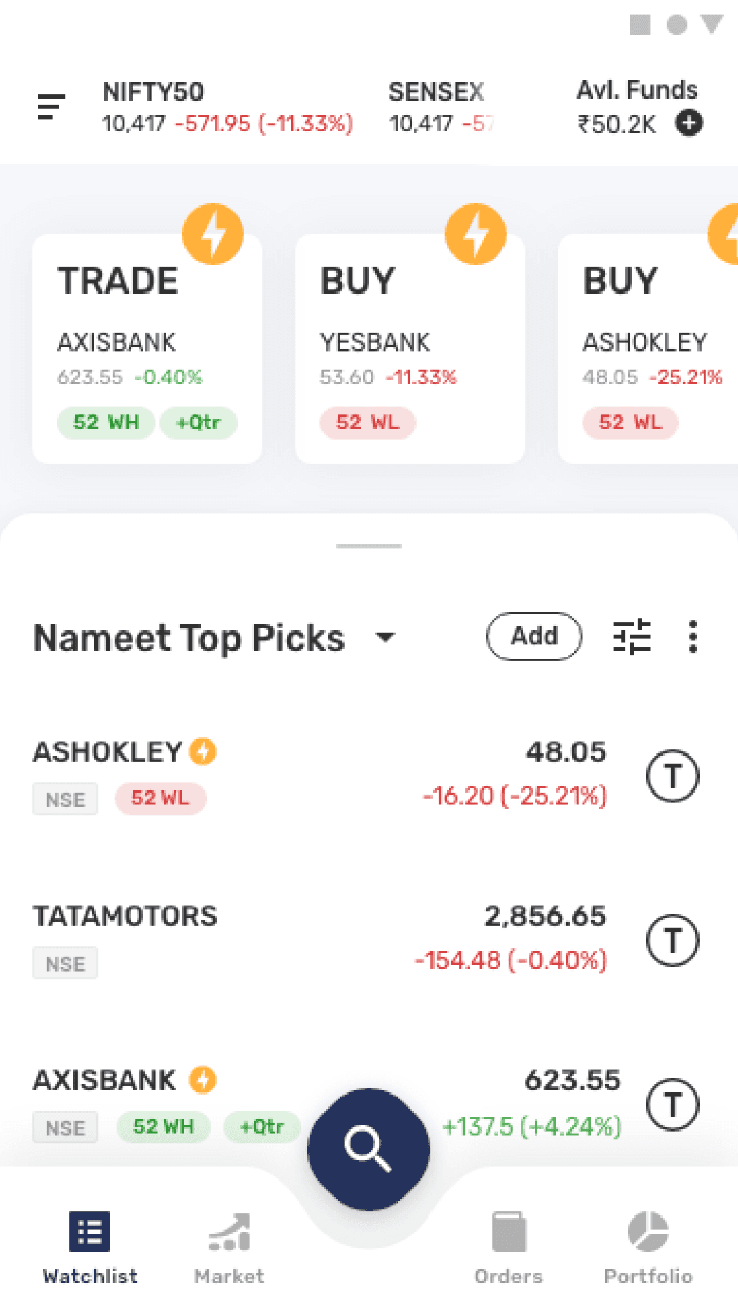

Prototype preview
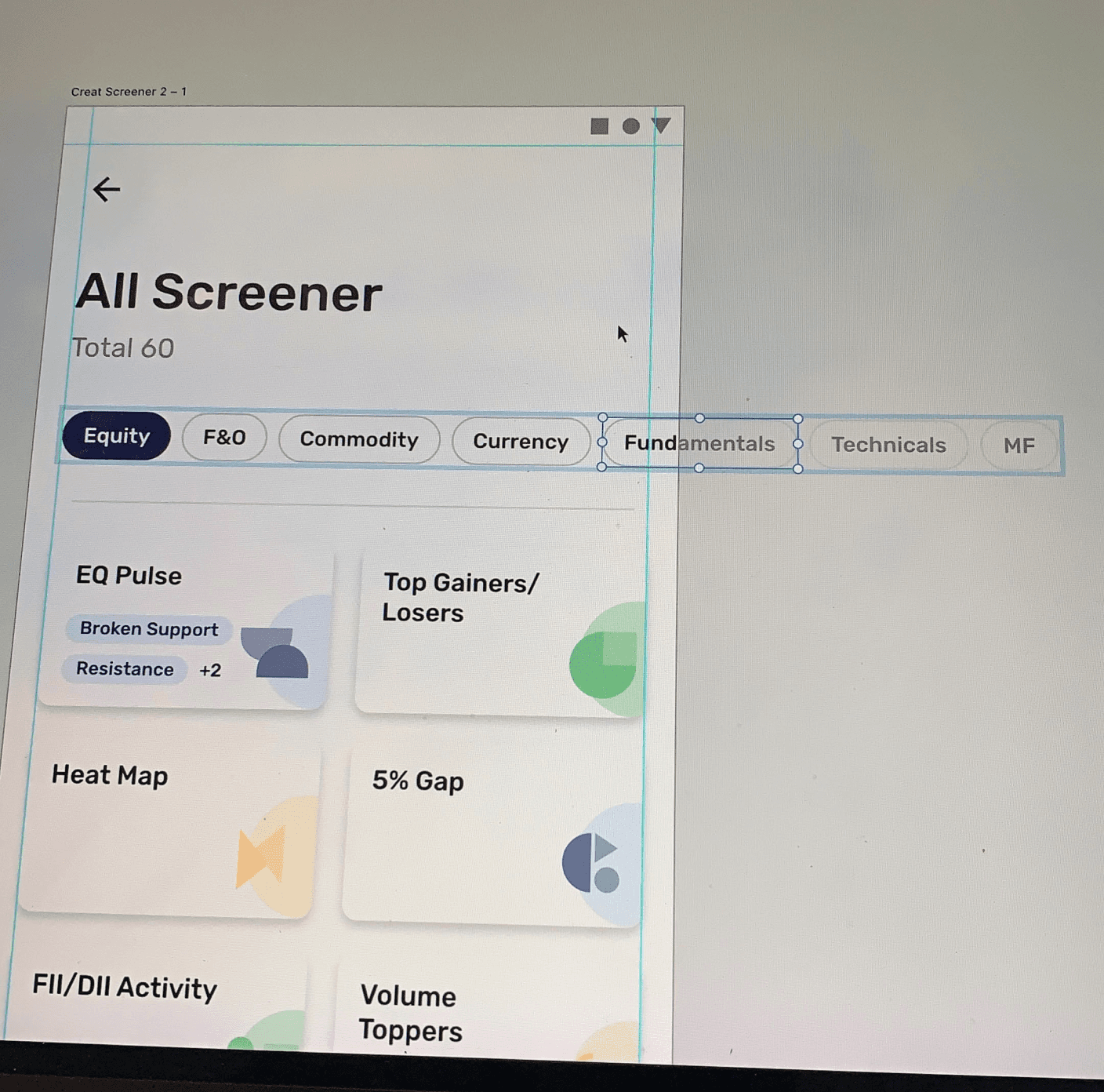
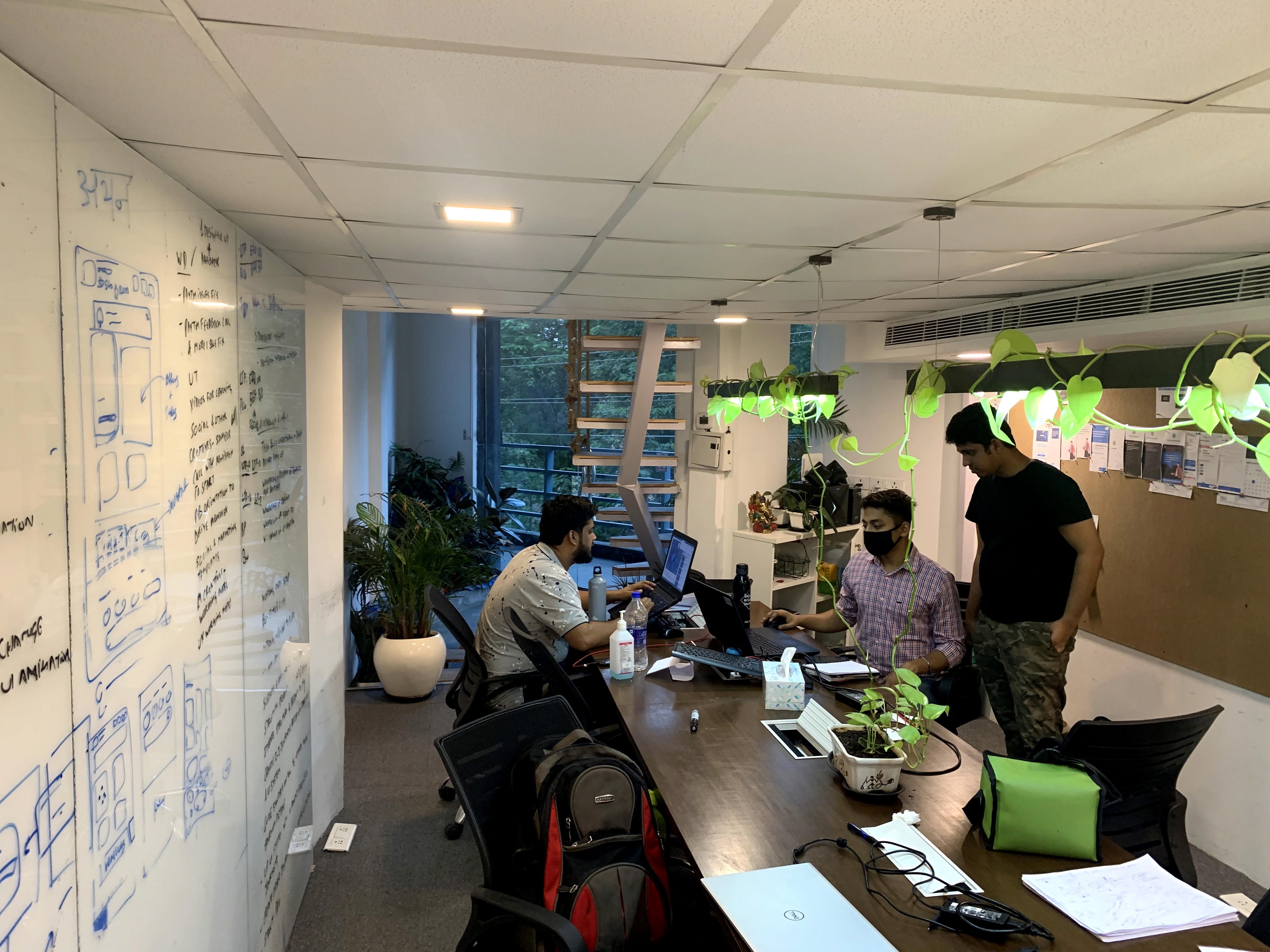
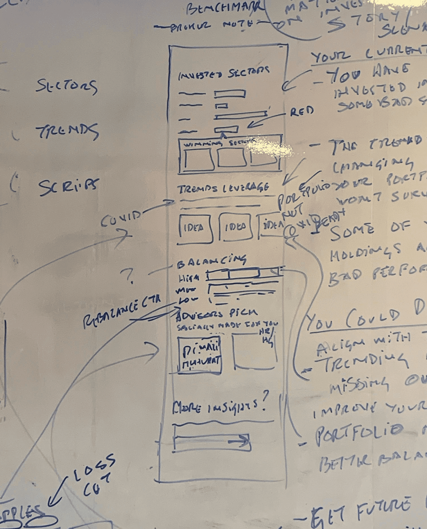
Behind the scenes
Few glimpses of the work.
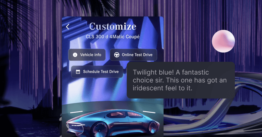
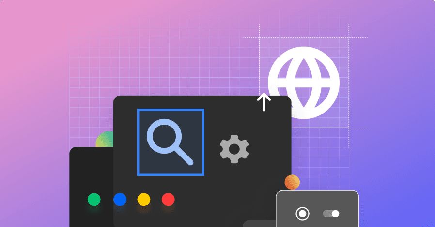
Other work
Not enough? Here is more.
Please view it on desktop. The mobile version will be out soon.
Apologies for the inconvenience. The mobile version will be out soon. Thank you for your understanding.


